
After my two previous articles I’ve found that I love writing about the ideas I come up with for someones product. Whether it is for my projects or just a site I use, I just love the creative thinking of looking at something and thinking of ways of how I would make it better if I could. So starting today I am introducing these new type of articles, articles of ideas that I have for someone else’s website, program or tool. I will be updating these articles with other ideas as they come to me, so be sure to come back and check them out.
This week I am going to cover Evernote.
I love Evernote and I use it anytime that I can. So I thought why not officially kick start this new type of article with the tool I love the most. Here are some of the things that I would change or add to Evernote to make it work better for me.
- Geo location features for the web and desktop versions. Allow me to be able to set the geo-location manually in desktop versions in the settings.
- Include the map feature from the mobile phones in the desktop and web apps so that I can see my geo-located notes.
- Make it possible for each note to have it’s own static URL, something similar to how Google does with each email in Gmail.
- The mobile site needs to look and act more like the desktop and mobile clients.
- Drag and drop image/file support like they have in Gmail.
- We need an easy way to get the url for shared notebooks. When looking at the properties of a notebook it should include the URL of the notebook if it is shared.
- Allow me to have sub-notebooks.
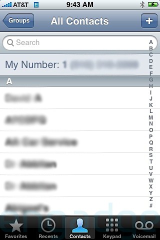
- Tags on the iPhone and Android should be laid out alphabetically with the alphabet selection on the right hand side, so that users can quickly navigate to the tag they want, similar to the iPhones contacts and music. View image below for what I am talking about
- The link “All Notebooks” on the web version should be on the top like the other clients.
- Support for HTML5 Video and Audio elements. Example: all audio notes should using the tag.
- We need advanced text edition on phones, and better support on the web.
- Carriage returns do not hold properly at times. They either get removed or there is an extra one added, there is no way to know which one you will get.
- The ability to edit and rearrange tags on the mobile devices.
- We need to suggested tags on the iPhone and Android versions. This is where we start to type a couple of letters and Evernote checks to see which tags have those letters and will make them a pop-under to suggest those to the user. This is currently done on the web app, windows desktop, and chrome extension.
- Speed up the time it takes to add tags to notes on the Windows client. This seems like something that should be fairly snappy, since it is on the Chrome Extension and Web client.
- Able to Sort tags on all clients by number of notes associated with it.
- A “Back” button on the web client. After opening any note it would be nice to see a “Back” button to go back to the page you were previously on. If you hit the back button on the browser you get the results that I am looking for, but it would be nice to have a simple “Back” button on the actual website.
- A “Reload” button. I currently will go through and make sure that all of my notes get tags and moved into the correct notebook once a month. I can have hundred of notes that I am working with that do not have tags and labels at the end of the month. I have a saved search for “-tag:*” which finds all notes that have no tags associated with them. While I am working I would like to be able to eliminate the notes that I have tagged so that I can see that I am making progress, having the reload button would remove all notes that do not fit the “-tag:*” search criteria.

Update 8:20am 5/13/10:
- The ability to upload multiple files at once to the web client
August 31st, 2010 at 5:29 am
I htink Evernote realy needa a good ‘reading mode’
especially in the desktop versions. I only have the mac one, but i use it to do my Masters degree
I have loads of docs and notes to organise and scan. It does all that well, but it is a bit ‘noisy’ for later reading
I would lime a feature where you could open a doc and have the rest of the background ‘go away’ or darken
similar to word, Adobe Reader or Photoshop is able to
August 31st, 2010 at 9:24 am
I totally agree with you. I think that the note creation portion is fairly straight forward now. Now we need a nice way of viewing our notes. One way I just thought of would be to include a button on each note with a small arrow which you can click on and it opens the note into a new/separate window. I know that we can double click on any note to do this, but eliminating a click would make this more fluid I believe. I would also love to see a way to have a static URL for each note, meaning that I can have a url that I can give to someone to view one note or be able to reference a note within a note.